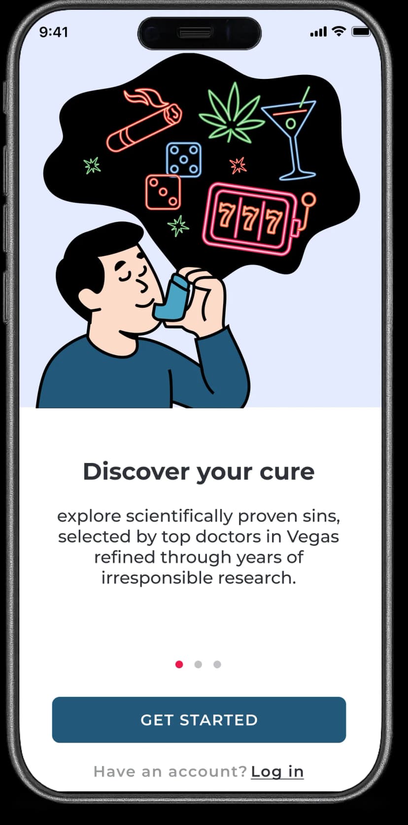
How do I signal this is Vegas wrapped in medical language - without explaining it? Too medical kills the joke. Too obvious kills the tension.
A man using an inhaler - a medical device for routine treatment. But his thought bubble explodes with Vegas. The contrast is instant and absurd. The image says medical. The thought bubble says Vegas. The copy reveals satire.
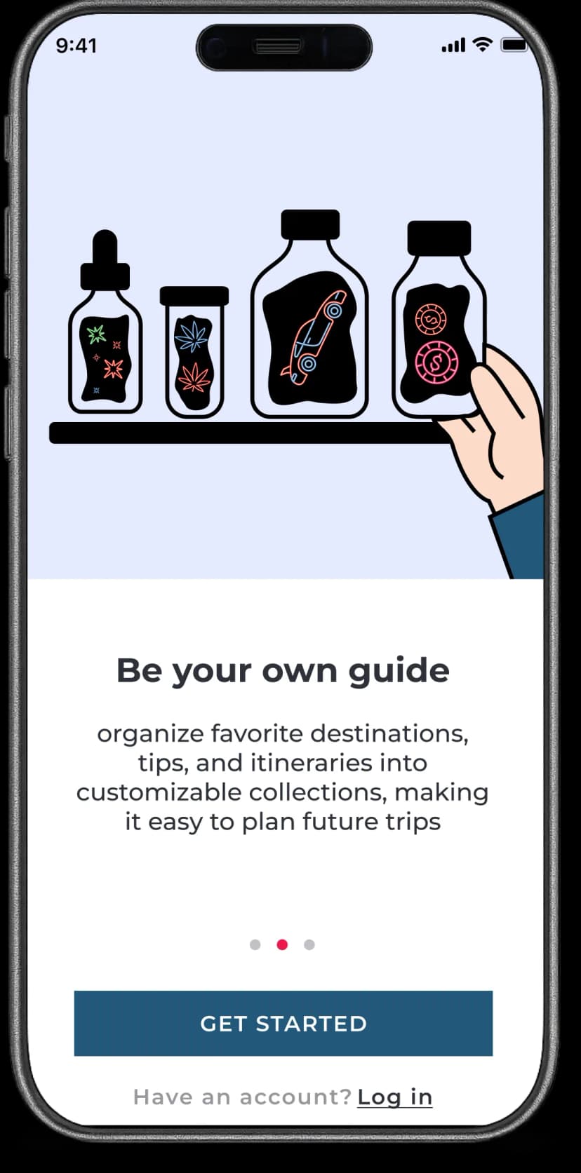
If users organize Vegas trips into collections, what's the medical equivalent? Where do you store "prescriptions"?
Medicine shelf. Clinical bottles with clean labels. But inside: neon Vegas chaos - dice, cards, cocktails. Organization meets temptation.
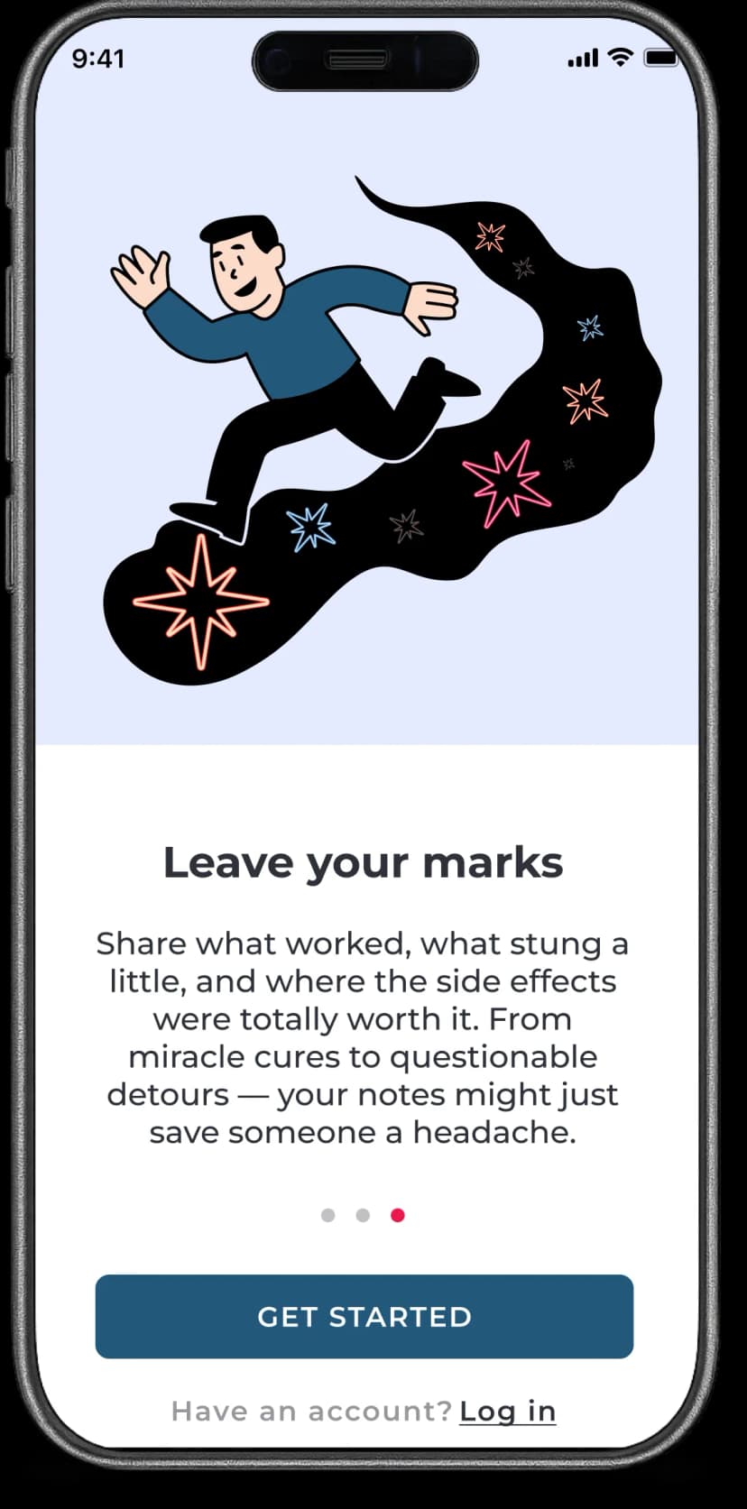
In the Vegas-as-medicine metaphor, what are "ratings"? What do users leave behind after trying their "prescription"?
A man leaping forward in the clean medical interface. Behind him: a glowing trail of neon stars - Vegas memories, past experiences, side effects documented. Reviews become your Vegas constellation - a trail others can follow.
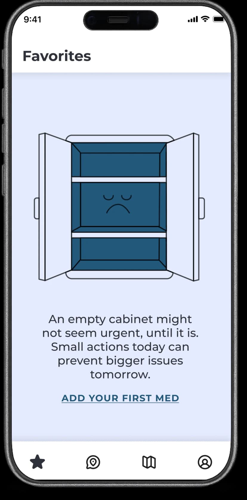
In a medical app about Vegas sins, emptiness should feel unsettling. How do I make the absence of "treatments" feel like something's missing?
Strip away the vibrant palette. Muted tones, sterile shelves, emptiness. A simple sad face on the shelf - minimal withdrawal.
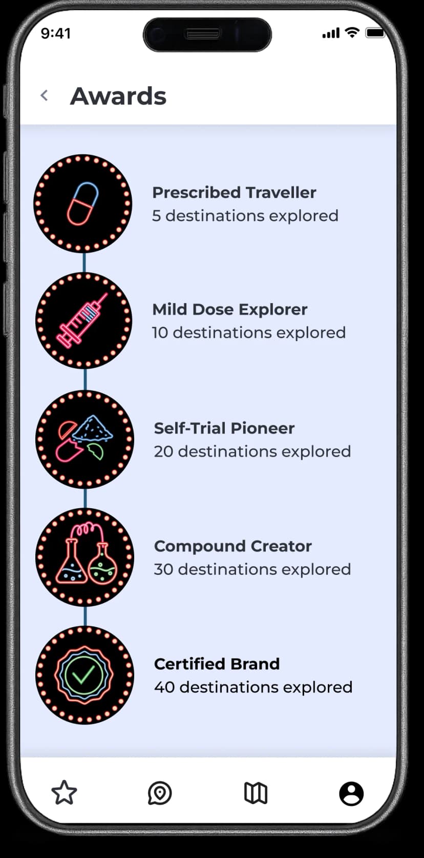
Travel apps use badges for exploration. In a Vegas-as-medicine app, what does “progression” mean? How do I turn gamification into medical metaphor?
The more destinations you explore, the more "experienced" you become - not with travel, but with substances.
Loading...